
libreoffice calc is an alternative for microsoft excel to do spreadsheet.
while working in spreadsheet you might want to display it as a chart.
in librecalc, you can find standard chart such as bar, stacked, pie, etc. but, unfortunately, when you want to have specific chart, such as waterfall chart, you won’t find it in libreoffice calc.
so, i try to find out, and manage to find an article on how to generate the waterfall chart manually.
i said manual, since in microsoft excel, you can generate the waterfall chart instantly.
so for example, i want to know how is the gap between english premier football team standing, up to matchweek 28 season 2024/2025.
| Club | Played | Won | Drawn | Lost | GF | GA | GD | Points |
|---|---|---|---|---|---|---|---|---|
| Liverpool | 29 | 21 | 7 | 1 | 69 | 27 | 42 | 70 |
| Arsenal | 28 | 15 | 10 | 3 | 52 | 24 | 28 | 55 |
| Nottingham Forest | 28 | 15 | 6 | 7 | 45 | 33 | 12 | 51 |
| Chelsea | 28 | 14 | 7 | 7 | 53 | 36 | 17 | 49 |
| Manchester City | 28 | 14 | 5 | 9 | 53 | 38 | 15 | 47 |
| Newcastle United | 28 | 14 | 5 | 9 | 47 | 38 | 9 | 47 |
| Brighton and Hove Albion | 28 | 12 | 10 | 6 | 46 | 40 | 6 | 46 |
| Aston Villa | 29 | 12 | 9 | 8 | 41 | 45 | -4 | 45 |
| Bournemouth | 28 | 12 | 8 | 8 | 47 | 34 | 13 | 44 |
| Fulham | 28 | 11 | 9 | 8 | 41 | 38 | 3 | 42 |
| Crystal Palace | 28 | 10 | 9 | 9 | 36 | 33 | 3 | 39 |
| Brentford | 28 | 11 | 5 | 12 | 48 | 44 | 4 | 38 |
| Tottenham Hotspur | 28 | 10 | 4 | 14 | 55 | 41 | 14 | 34 |
| Manchester United | 28 | 9 | 7 | 12 | 34 | 40 | -6 | 34 |
| Everton | 28 | 7 | 12 | 9 | 31 | 35 | -4 | 33 |
| West Ham United | 28 | 9 | 6 | 13 | 32 | 48 | -16 | 33 |
| Wolverhampton Wanderers | 28 | 6 | 5 | 17 | 38 | 57 | -19 | 23 |
| Ipswich Town | 28 | 3 | 8 | 17 | 26 | 58 | -32 | 17 |
| Leicester City | 28 | 4 | 5 | 19 | 25 | 62 | -37 | 17 |
| Southampton | 28 | 2 | 3 | 23 | 20 | 68 | -48 | 9 |
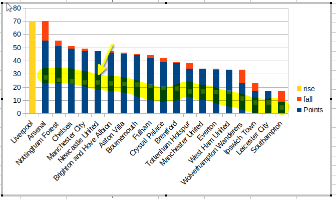
but i don’t need all columns, i just want to see the gap in the point.
so first, i set the team in the first position – liverpool, as the benchmark. i set rise column the same as its point.
then on the second row, on fall column, i do formula, deducted the points from previous row with current points. copy the formula and paste it until the bottom of the table.
there i have all fall column filled.
| Club | Points | fall | rise |
|---|---|---|---|
| Liverpool | 70 | 70 | |
| Arsenal | 55 | 15 | |
| Nottingham Forest | 51 | 4 | |
| Chelsea | 49 | 2 | |
| Manchester City | 47 | 2 | |
| Newcastle United | 47 | 0 | |
| Brighton and Hove Albion | 46 | 1 | |
| Aston Villa | 45 | 1 | |
| Bournemouth | 44 | 1 | |
| Fulham | 42 | 2 | |
| Crystal Palace | 39 | 3 | |
| Brentford | 38 | 1 | |
| Tottenham Hotspur | 34 | 4 | |
| Manchester United | 34 | 0 | |
| Everton | 33 | 1 | |
| West Ham United | 33 | 0 | |
| Wolverhampton Wanderers | 23 | 10 | |
| Ipswich Town | 17 | 6 | |
| Leicester City | 17 | 0 | |
| Southampton | 9 | 8 |
then, select the table, all, and then create stacked bar chart. just click ‘finish’ button. just let it all by default.
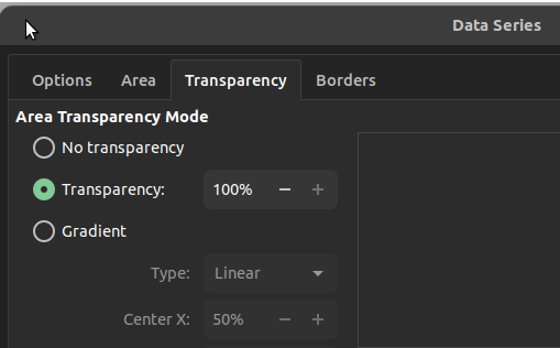
after the chart generated, edit it, then click on one of the ‘points‘ bar, make sure all other ‘points‘ bar get selected too. it is should be automatically selected. e.g.: click on Newcastle United points bar, all other points bar should be selected too.
after that, do right click on that points bar, and select ‘Format Data Series’.
set ‘Transparency’ to 100%
voilà! there you go! waterfall chart.
adjust it a little bit, and then you’ll be fine.


setelah *akhirnya* berkesempatan menonton gundala di vidio, gue merasa banyak hal yang belum gue ketahui tentang gundala. ketika saat jaman Read more
bisa dibilang gue hampir tiap tahun ikutan self-challenge #inktober ini. #inktober adalah menantang diri sendiri untuk menggambar atau melukis setiap hari dalam Read more
rencana cuma jenguk bu de yang sakit di dekat rumah, jadi persiapan ya standar aja, henpon, dompet, sudah. selesai dari Read more
so, it seem the gap between liverpool and arsenal is huge.
while the other teams gap are narrow, except in the bottom table.
credit: header image from reddit.

